Barnes & Noble
Creating an industry standard design
Tools: Figma
About: Barnes & Noble is the leading retail bookseller in the United States, providing a curated selection of books, magazines, eBooks, toys, games, and educational resources. I am optimizing a user flow by incorporating essential industry-standard features and information, establishing a robust baseline for user expectations. This foundation allows for strategic innovation, enhancing usability and enabling unique design enhancements beyond conventional standards.
Role: UX Researcher, UX/UI Designer
UX Research
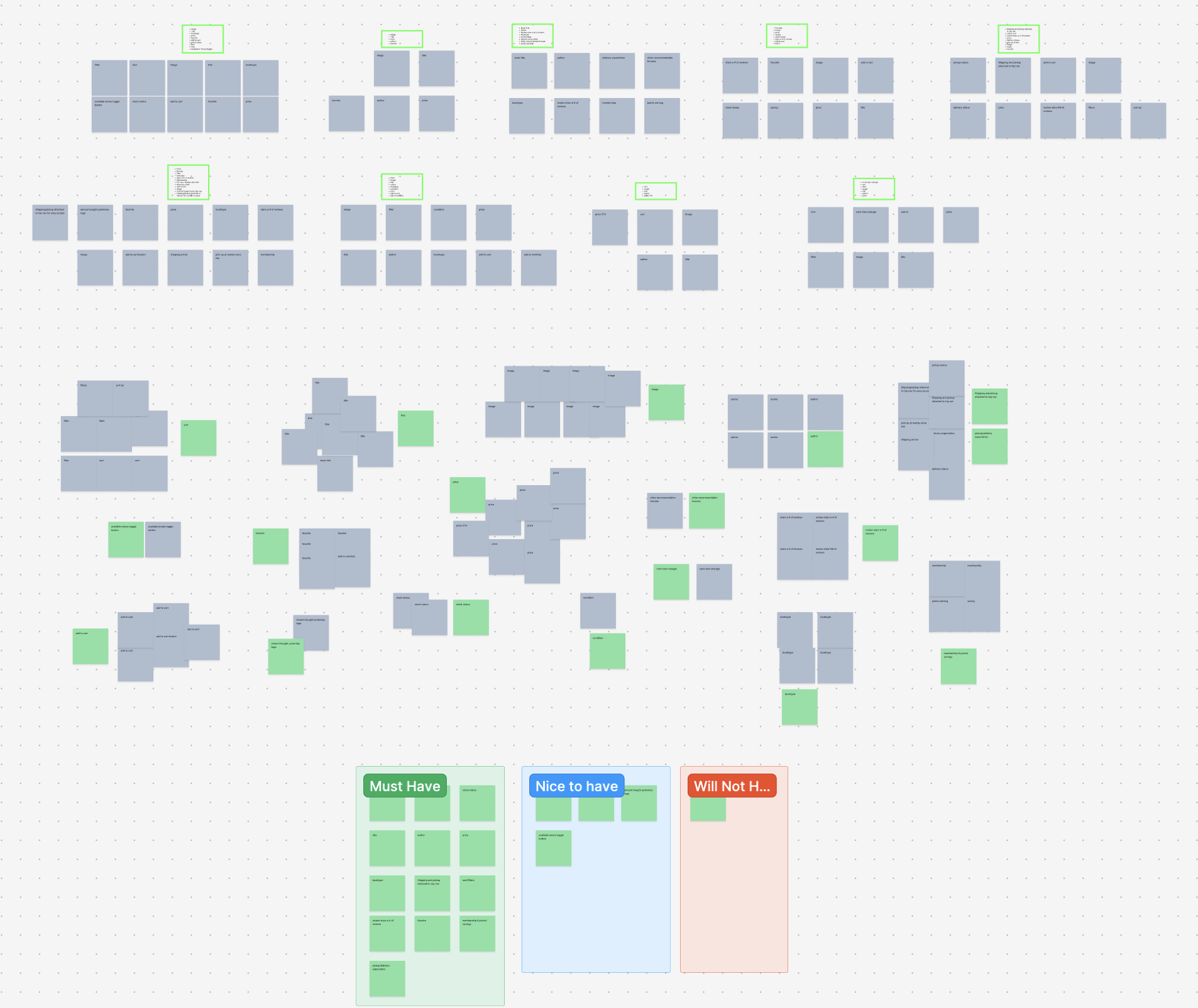
Following a comprehensive design audit of nine competitors, I synthesized key features onto sticky notes and conducted an affinity mapping exercise. This approach enabled effective categorization and pattern recognition, providing clarity on industry standards and highlighting strategic opportunities for differentiation.


Personas
Personas are used to create a clear, relatable picture of the target audience. By defining specific user types, we can better understand their needs, goals, and pain points, which helps guide design decisions to make the experience more relevant and user-centered. Personas keep us focused on real users rather than assumptions, ensuring that our design choices truly address their expectations and behaviors.


User Journey

Robin’s Journey
Smith’s Journey

User journeys were utilized to map out the steps and interactions a user takes to achieve their goals on the site. This approach allowed us to identify key touchpoints, pain points, and opportunities to enhance the experience, ensuring that each design decision was aligned with user needs and expectations.
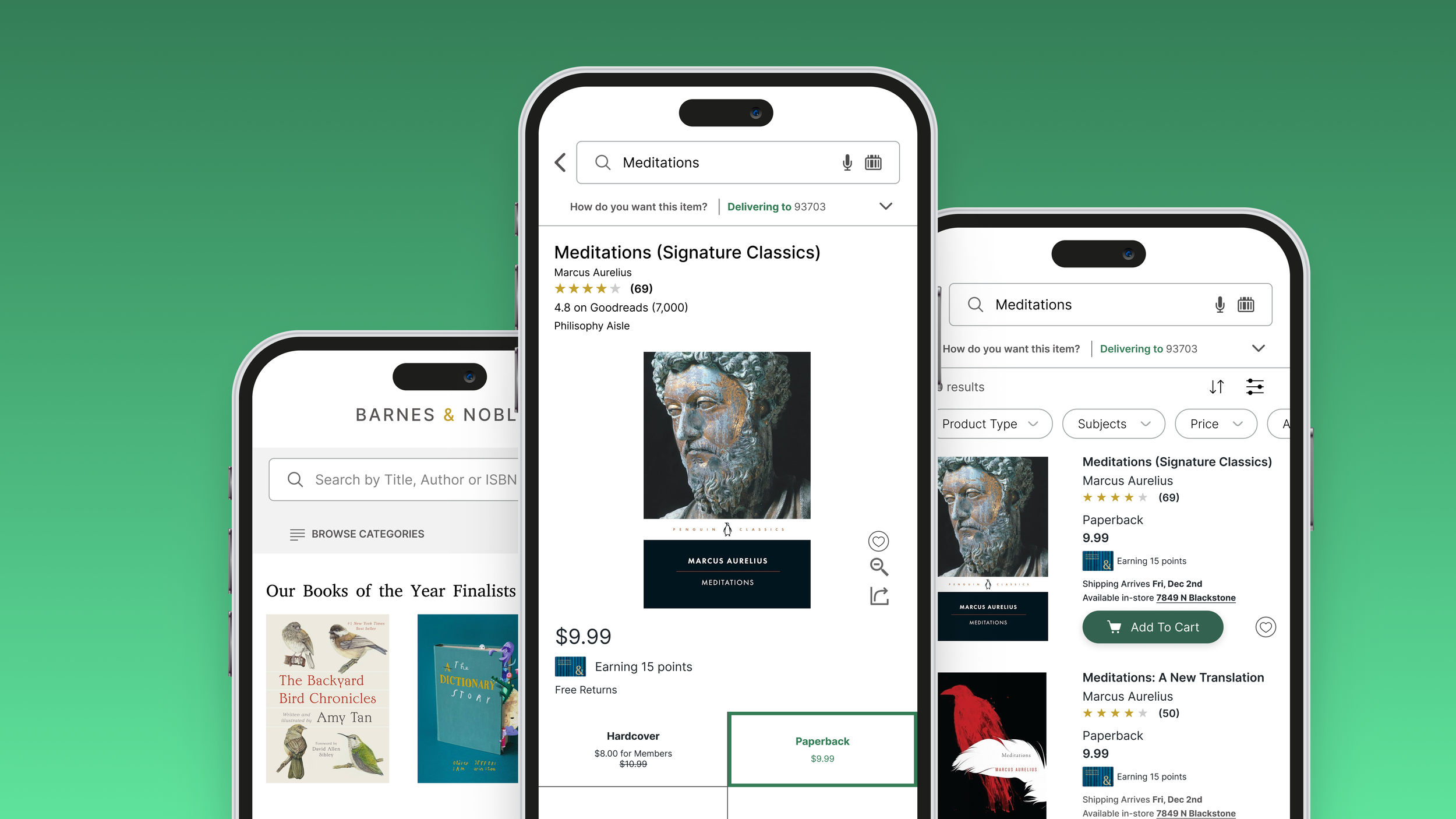
Wireframes

I integrated a microphone feature and updated the barcode scanner icon to a more accurate representation, enhancing both functionality and visual clarity.

The top navigation dropdown has been designed to give users greater control over how they manage items throughout their journey
Additionally, I reorganized the sort and filter buttons, moving them closer together for easier accessibility, as their previous placement on the far left made tapping awkward.
Added concise membership savings information to benefit current members and encourage non-members to join.
Included brief shipping and in-store pickup information to align with industry standards found in leading e-commerce apps.
Implemented a Like/Favorite button accessible directly from the main view, as the current option is only available on the book details screen.


Incorporated reviews from Goodreads, a popular book review platform, and added information on in-store book location to enhance user experience
Added Like/Favorite, Zoom, and Share options to clearly indicate available actions to the user
Membership savings
This is the most significant structural update I've made to this page. I replaced separate pill buttons with a tile/tab layout, allowing all information to be easily glanceable. With this design, the screen updates dynamically whenever an option is selected, enhancing user interaction and clarity.
This is the tab feature I mentioned—when tapped, it triggers changes in the displayed information below, providing a dynamic and responsive user experience.
I added book details that were previously tucked away, based on insights from competitor research. Making this basic information glanceable for the user improves accessibility and enhances the overall browsing experience.
This approach allows users to dive deeper into the application, providing them with more control and flexibility over their experience.
While customer reviews were already available, I added a summary graph to provide users with a quick overview of all reviews. This enhancement aligns the feature with e-commerce standards and improves the overall user experience.
User Testing
I used user flows to visually map each step users take to complete tasks, allowing us to identify potential friction points and ensure a smooth, intuitive experience throughout their journey.


Final Design


User Flows
I used user flows to visually map each step users take to complete tasks, allowing us to identify potential friction points and ensure a smooth, intuitive experience throughout their journey.


Key Takeaways
User testing plays a crucial role in refining design, as it provides a broad spectrum of feedback essential for understanding diverse user perspectives. Additionally, leveraging tools such as card sorting can be highly effective for structuring information intuitively, though it’s equally important to recognize scenarios where such methods may not be appropriate.